Before you begin, ensure that you have access to either the online version of TriplotGUI or can use TriplotGUI as a stand-alone application on your computer following Setup.
Data description
The datasets utilized in this tutorial can be downloaded here as data frames in the following RDS files.
- Example1_exposure.rds
- Example1_Omics.rds
- Example1_outcome.rds
- Example1_covariate.rds
These datasets originate from CAMP_2, a synthetic dataset derived from the original CAMP data provided by the Triplot package (Schillemans et al., 2019). The CAMP dataset itself was simulated from authentic data collected in a cross-sectional study examining carbohydrate alternatives and metabolic phenotypes among young adults in China (Liu et al., 2018).
Our selection of exposures, Omics data, outcomes, and covariates is based on the CAMP_2 data, as detailed in the accompanying code here. Below is a brief description of each dataset:
- Example1_exposure.rds: Contains 14 variables that represent dietary intake measured through food frequency questionnaires. These variables include
"Refined_grains","Coarse_grains","Red_meat","Poutry","Seafood","Egg","Animal_organs","Vegetables","Fruits","Potatos","Legumes". All 11 variables are continuous/numeric. - Example1_Omics.rds: Comprises 20 variables that represent plasma metabolites predictive of Body Mass Index (BMI). All variables are continuous/numeric.
- Example1_outcome.rds: Includes 5 variables representing clinical measurements:
"BMI","HDL"(high-density lipoprotein cholesterol),"LDL"(low-density lipoprotein cholesterol),"triglycerides"and"total_cholesterol". All these variables are continuous/numeric. - Example1_covariate.rds: Contains 2 variables that may serve as potential confounders:
-
"AGE": A continuous/numeric variable. -
"SEX": A factor variable with 2 levels: 1 and 2.
-
All datasets are row-wise matched by observation and consist of a total of 300 synthetic observations.
Reference
Liu X, Liao X, Gan W, et al. Inverse Relationship between Coarse Food Grain Intake and Blood Pressure among Young Chinese Adults. Am J Hypertens. 2019;32(4):402–408. 10.1093/ajh/hpy187
Schillemans T, Shi L, Liu X, Åkesson A, Landberg R, Brunius C. Visualization and Interpretation of Multivariate Associations with Disease Risk Markers and Disease Risk-The Triplot. Metabolites. 2019 Jul 6;9(7):133. doi: 10.3390/metabo9070133
Research question
We aim to assess the relationship between diet, metabolic profiles, and risk factors for metabolic diseases, including BMI, total cholesterol, triglycerides, HDL, and LDL. In this context, we assume that metabolites act as mediators, facilitating the effect of dietary exposures on these risk factors.
The use of interface
To demonstrate the functionality of the interface, we will provide an example on this page that corresponds to the code implementation outlined in the Code example of using TriplotGUI section. This will allow you to see how the interface operates in practical terms.
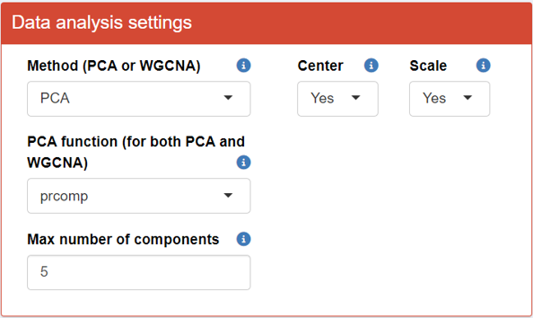
Step 1: Data reduction of Omics variables
First, upload the Omics data in Step 1 of the interface.
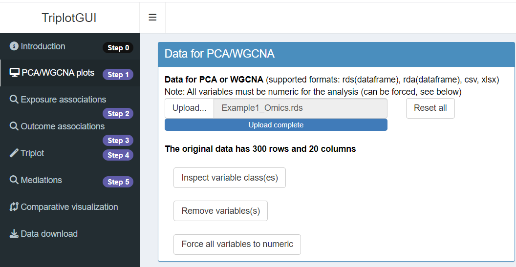
After successfully uploading the data, a series of buttons will appear, allowing you to make modifications to the data reduction process for the Omics data.
Once the upload is complete, you can explore the visualization panel on the right side. Here, you will be able to view all the relevant plots (score, loadings, biplot, screeplot).
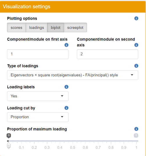
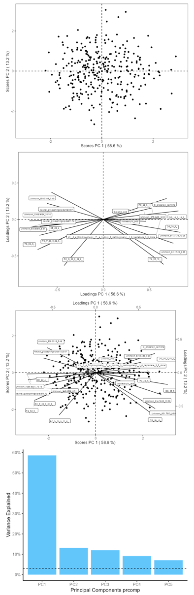
- Scree Plot: Assess the variance explained by each principal component.
- Score Plot: Visualize sample clustering and identify any outliers.
- Loadings Plot: Examine the contribution of each variable to the principal components.
- Biplot: Get a comprehensive view of how samples relate to each other alongside variable contributions.
Step 2-3: Exposures-Omics and Omics-Outcomes associations
Next, proceed to upload the exposures, outcomes, and covariates data in Steps 2 and 3 of the interface.
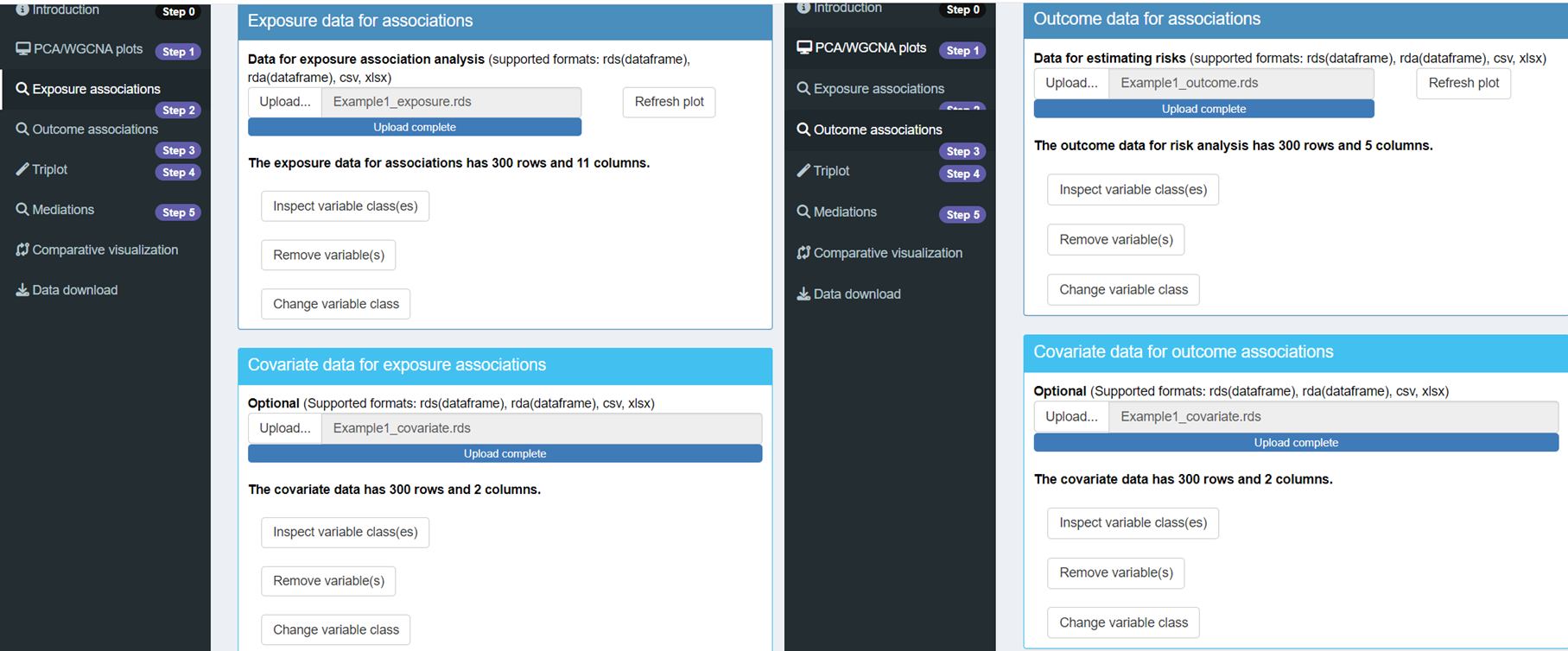
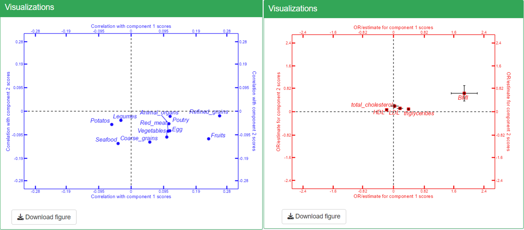
Once you have uploaded these datasets, you can view the correlation coefficients in Step 2 and the risk estimates in Step 3. To refresh the visualizations and see the updated plots, simply click on the Refresh Plot button. This will allow you to analyze the relationships between your exposures, outcomes, and covariates effectively. Confounder adjustment was selected as Yes in Confounder adjustment in the “Data analysis settings”.
Step 4: Meet-in-the-middle Triplot Visualization
In Step 4 of the interface, you can view and download the triplot by clicking Refresh Plot The left-side panel allows you to make adjustments to the plot as needed.
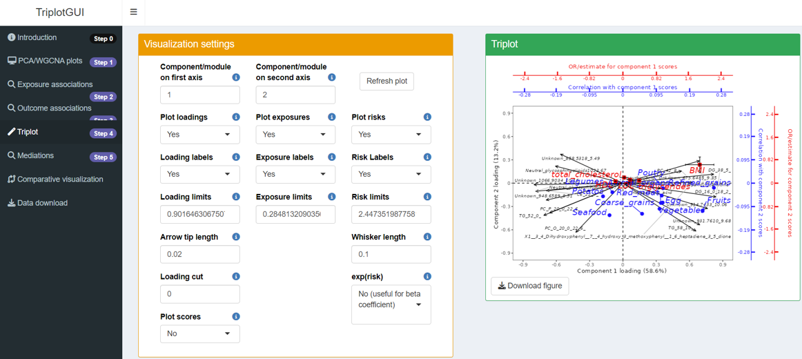
In the triplot, black arrows represent loadings of Omics variables, forming patterns in different components (axes). Blue circle points show exposure correlations with the components, while red square points indicate outcome associations with the components.
For interpretation, let’s focus on Principal Component 1 (PC1) and Principal Component 2 (PC2), using the exposures "Refined grains", "Red meat", and the outcome "BMI" as examples:
PC1: This component shows a positive association with BMI and is correlated with high intakes of red meat and refined grains, even after adjusting for age and sex. This suggests that the metabolite features dominating PC1 may provide valuable insights into how the intake of red meat and refined grains could influence BMI.
PC2: In contrast, PC2 exhibits a smaller association with BMI and a weak inverse correlation with red meat and refined grains. The metabolite features contributing significantly to PC2 may indicate a marginal beneficial effect of these dietary components, although this effect appears to be limited. This may also suggest that the features dominating PC2 may reflect metabolite patterns influenced by food, but not to a large degree associations with metabolic regulation in relation to health.
This interpretation highlights how different dietary exposures relate to metabolic outcomes, offering insights into potential mechanisms at play.
Step 5: Mediation analysis and visualization
Mediation analysis will be performed using the conventional(Baron-Kenny) method on our selected exposures ("Refined grains", "Red meat"), and the outcome of interest ("BMI"), using components (PC1-5) generated from Step 1 as mediators and adjusting for age and sex in both the exposure-mediator and mediator-outcome associations.
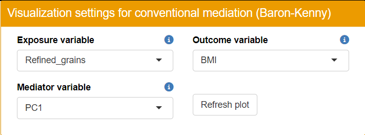
After mediation analysis is performed, users can select which exposure, mediator and outcome variables to use for mediation barplot visualization.
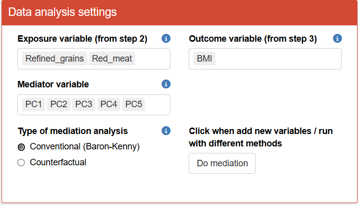
- Please note that you need to click Do Mediation to initiate the mediation analysis.
In Step 5 of the interface, you can view barplots that display the direct, indirect, and total effects for each exposure-mediator-outcome combination. This tool conveniently illustrates the direction and magnitude of mediation estimates.
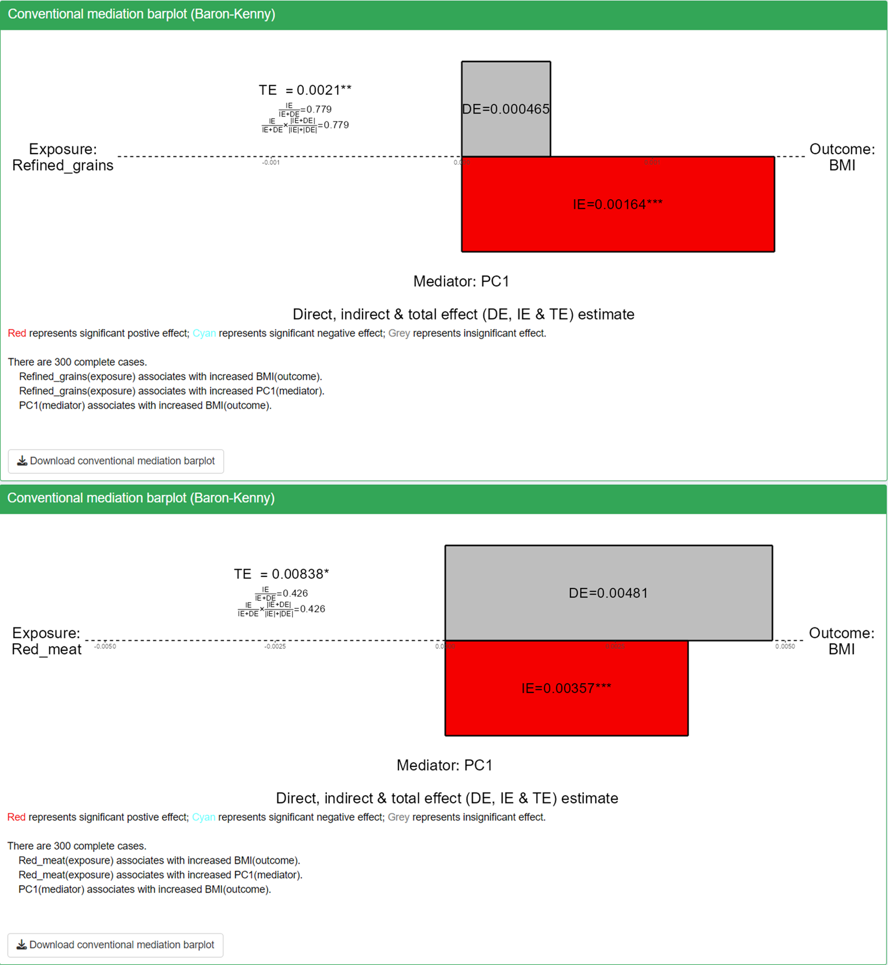
The barplot displays direct, indirect, and total effects for each exposure-mediator-outcome combination, providing a convenient tool to assess the direction and magnitude of mediation estimates.
- Color coding indicates significance and direction: red represents significant positive effects (p<0.05), blue represents significant negative effects (p<0.05), and grey represents insignificant effects.
- Significance levels are denoted by stars: one star for p<0.05, two stars for p<0.01, and three stars for p<0.001.
Based on the mediation barplot, we observed significant mediation effects through PC1 for the red_meat-BMI and refined_grain-BMI associations. This finding suggests that the metabolite features contributing to PC1 are likely mediating the pathway from red meat and refined grain intake to BMI changes. These results provide insight into potential metabolic mechanisms linking dietary patterns to body mass index.
Comparative Visualization
Users can check the heatmaps of exposure associations, risk estimations, and mediation results in Comparative Visualization of the interface. To focus specifically on the results relevant to PC1 and PC2, you can remove other principal components in the “Visualization Settings.” This will streamline the analysis, allowing for a clearer interpretation of the relationships involving these two components.
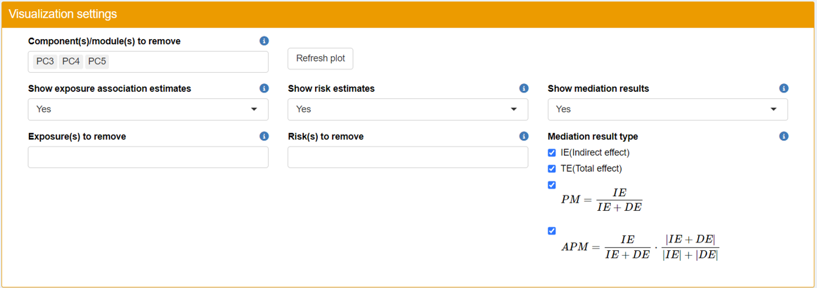
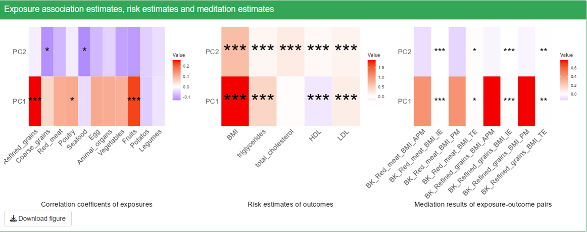
- Significance is indicated as follows. One star for p<0.05; Two stars for p<0.01; Three stars for p<0.001.
- The first two plots, correlation coefficients with exposures and risk estimates of outcomes will show all the exposure and outcome variables that are not removed from visualization.
- Note that only the selected exposures, mediators and outcomes that we use to do mediation on will show up in the mediation results. The rows in the heatmaps are mediators and the column represents exposure-outcome pairs. For each exposure-outcome pair, 4 result are shown: IE (indirect effect), TE (total effect), PM(Proportion Mediated) and APM(Adjusted Proportion Mediated). Please see Details section for more information. The “BK” before the names of exposures-outcome pairs means that this mediation is using the Conventional Baron-Kenny “product” method. For this method, only the significant level of IE and TE is calculated and shown on the plot, but not PM and APM.
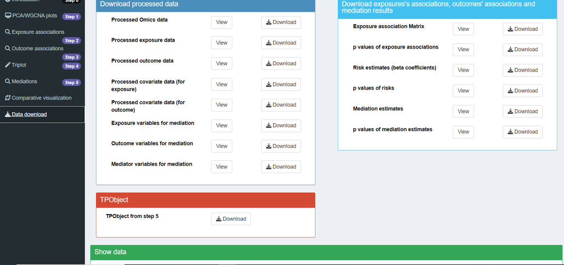
Data download
Relevant data and intermediate results can be viewed and downloaded directly from the interface.